 study-notes
推荐阅读
https://developer.mozilla.org/zh-CN/docs/Web/CSS/CSS_transitions/Using_CSS_transitions
为什么需要使用过渡?
默认情况下, 这样的代码会立即变化, 效果非常生硬
html
<!doctype html>
<html lang="zh-cn">
  <head>
    <title>JavaScript</title>
    <style>
      #box {
        background-color: #f00;
        height: 50px;
        width: 100px;
      }
      #box:hover {
        width: 300px;
      }
    </style>
  </head>
  <body>
    <div id="app" class="container">
      <div id="box"></div>
    </div>
  </body>
</html>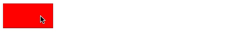
如果想要让属性变化有一个过程动画, 而不是瞬间完成, 那么就需要使用 CSS3 的过渡模块
html
<!doctype html>
<html lang="zh-cn">
  <head>
    <title>JavaScript</title>
    <style>
      #box {
        background-color: #f00;
        height: 50px;
        width: 100px;
        /* 哪个属性变化需要使用过渡效果, 而不是直接变化 */
        transition-property: width;
        /* 过渡效果持续时间 */
        transition-duration: 1s;
      }
      #box:hover {
        width: 300px;
      }
    </style>
  </head>
  <body>
    <div id="app" class="container">
      <div id="box"></div>
    </div>
  </body>
</html>
过渡效果3要素
- 必须要有属性发生变化
- 哪些属性需要使用过渡效果
- 过渡效果持续时长
多个属性发生变化
使用逗号隔开
html
<!doctype html>
<html lang="zh-cn">
  <head>
    <title>JavaScript</title>
    <style>
      #box {
        background-color: #f00;
        height: 50px;
        width: 100px;
        transition-property: width, height;
        transition-duration: 1s, 1s;
      }
      #box:hover {
        width: 300px;
        height: 100px;
      }
    </style>
  </head>
  <body>
    <div id="app" class="container">
      <div id="box"></div>
    </div>
  </body>
</html>过渡延迟
加上 transition-delay 过渡效果就不会立即执行, 而是要等1s之后才开始执行过渡, 默认值是 0, 如果简写模式, 可以不写
html
<!doctype html>
<html lang="zh-cn">
  <head>
    <title>JavaScript</title>
    <style>
      #box {
        background-color: #f00;
        height: 50px;
        width: 100px;
        transition-property: width, height;
        transition-duration: 1s, 1s;
        transition-delay: 1s;
      }
      #box:hover {
        width: 300px;
        height: 100px;
      }
    </style>
  </head>
  <body>
    <div id="app" class="container">
      <div id="box"></div>
    </div>
  </body>
</html>
过渡速度控制
可以在这个网站查看效果
| 值 | 描述 |
|---|---|
| linear | 默认值, 规定以相同速度开始至结束的过渡效果(等于 cubic-bezier(0,0,1,1)) |
| ease | 开始慢, 然后快,慢下来,结束时非常慢(等于 cubic-bezier(0.25,0.1,0.25,1)) |
| ease-in | 开始慢, 结束快(等于 cubic-bezier(0.42,0,1,1)) |
| ease-out | 开始快, 结束慢(等于 cubic-bezier(0,0,0.58,1)) |
| ease-in-out | 中间快, 两边慢(等于 cubic-bezier(0.42,0,0.58,1)) |
| cubic-bezier(n,n,n,n) | 在 cubic-bezier 函数中定义自己的值 |
html
<!doctype html>
<html lang="zh-cn">
  <head>
    <title>JavaScript</title>
    <style>
      .list,
      .item {
        margin: 0;
        padding: 0;
        list-style: none;
      }
      .list {
        width: 600px;
        border: 1px solid #eee;
      }
      .item {
        width: 100px;
        line-height: 30px;
        background: #f00;
        margin-bottom: 10px;
        transition-property: margin-left;
        transition-duration: 1s;
      }
      .list:hover .item {
        margin-left: 500px;
      }
      .item:nth-child(1) {
        transition-timing-function: linear;
      }
      .item:nth-child(2) {
        transition-timing-function: ease;
      }
      .item:nth-child(3) {
        transition-timing-function: ease-in;
      }
      .item:nth-child(4) {
        transition-timing-function: ease-out;
      }
      .item:nth-child(5) {
        transition-timing-function: ease-in-out;
      }
    </style>
  </head>
  <body>
    <div id="app" class="container">
      <ul class="list">
        <li class="item">linear</li>
        <li class="item">ease</li>
        <li class="item">ease-in</li>
        <li class="item">ease-out</li>
        <li class="item">ease-in-out</li>
      </ul>
    </div>
  </body>
</html>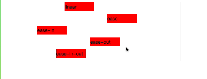
简写模式
css
/* transition: 过渡属性 过渡时长 过渡速度控制(可选) 过渡执行延迟(可选) */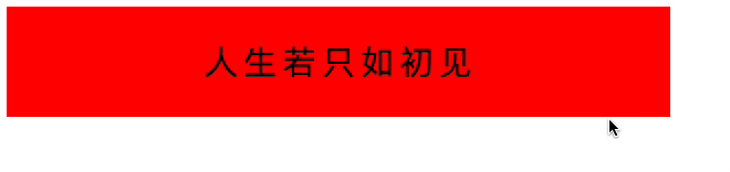
transition: width 500ms;过渡练习:弹性效果
html
<!DOCTYPE html>
<html lang="zh-cn">
  <head>
    <title>JavaScript</title>
    <style>
      #app {
        width: 600px;
        height: 100px;
        background-color: #f00;
        text-align: center;
        line-height: 100px;
      }
      #app span {
        font-size: 30px;
        margin: 0;
        transition: margin 1000ms;
      }
      #app:hover span {
        margin: 0 15px;
      }
    </style>
  </head>
  <body>
    <div id="app" class="container">
      <span>人</span>
      <span>生</span>
      <span>若</span>
      <span>只</span>
      <span>如</span>
      <span>初</span>
      <span>见</span>
    </div>
  </body>
</html>