 study-notes
基础知识
随着h5的应用范围越来越广, UI也随着发生了翻天覆地的变化, 这就导致了, 不是所有的布局都是规规矩矩的这种布局
有的需要一个元素根据一个参照物, 偏移指定距离来显示:
如 图标和图片的位置:

注:除了静态定位以外的其他定位会让元素脱离文档流
定位类型
| 取值 | 说明 |
|---|---|
| static | 默认行为, 参考文档流 |
| relative | 相对定位 |
| absolute | 绝对定位 |
| fixed | 固定定位 |
| sticky | 粘性定位 |
参照物
参照物是根据定位类型来决定的, 比如:
- 绝对定位是以
第一个相对定位的祖先元素作为参照物 - 相对定位是以
元素自身在正常文档流中的位置进行定位的 - 固定定位就是以
浏览器的可视区域来做参照物 - 粘性定位是以
元素所在的滚动容器来做参照物
偏移距离
| 属性 | 说明 |
|---|---|
| top | 参照物上边偏移量 |
| bottom | 参照物下边偏移量 |
| left | 参照物左边偏移量 |
| right | 参照物右边偏移量 |
静态定位 static
元素默认的定位方式就是静态定位, 也就是说, 在正常文档流钟的元素都是静态定位
相对定位 relative
css
#app {
  border: 1px solid blue;
}

.box {
  width: 100px;
  height: 100px;
  background: #f00;
  position: relative;
  top: 20px;
  left: 20px;
}html
<!doctype html>
<html lang="zh-cn">
  <head>
    <title>JavaScript</title>
    <link rel="stylesheet" type="text/css" href="./styles.css" />
  </head>
  <body>
    <div id="app">
      <div class="box"></div>
    </div>
  </body>
</html>
绝对定位 absolute
css
#app {
  border: 1px solid blue;
  margin: 20px;
}

.outer {
  width: 100px;
  height: 100px;
  position: relative;
  top: 0;
  left: 0; /* 横向,纵向的位置相当于和文档流的位置一样 */
  background-color: #f00;
  /*
    如果注释: position: absolute;
    那么 div.inner 在绝对定位的时候, 参照物就会继续向上寻找,
    直到找到一个元素为相对定位的祖先元素时, 以这个祖先元素为
    参照物, 如果没有找到, 那么就以浏览器的可视窗口为参照物
  */
}

.inner {
  position: absolute;
  width: 20px;
  height: 20px;
  top: 15px;
  left: 30px;
  background-color: #0f0;
}html
<!doctype html>
<html lang="zh-cn">
  <head>
    <title>JavaScript</title>
    <link rel="stylesheet" type="text/css" href="./styles.css" />
  </head>
  <body>
    <div id="app">
      <div class="outer">
        <div class="inner"></div>
      </div>
    </div>
  </body>
</html>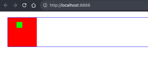
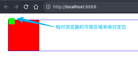
固定定位 fixed
css
.high-box {
  height: 5000px;
  width: 100%;
  background-color: #ccc;
}

#app {
  border: 1px solid blue;
  width: 100px;
  height: 100px;
  position: fixed;
  top: 20px;
  left: 20px;
}html
<!doctype html>
<html lang="zh-cn">
  <head>
    <title>JavaScript</title>
    <link rel="stylesheet" type="text/css" href="./styles.css" />
  </head>
  <body>
    <div class="high-box"></div>
    <div id="app"></div>
  </body>
</html>
黏性定位 sticky
css
#app {
  width: 100%;
  height: 300px;
  border: 1px solid #000;
  overflow: auto;
}

.contents {
  height: 1000px;
  background-color: #ccc;
}

.sticky-box {
  width: 500px;
  height: 100px;
  background-color: #f00;
  position: sticky;
  top: 10px;
  left: 10px;
}html
<!doctype html>
<html lang="zh-cn">
  <head>
    <title>JavaScript</title>
    <link rel="stylesheet" type="text/css" href="./styles.css" />
  </head>
  <body>
    <div id="app">
      <div class="contents">some contents</div>
      <div class="sticky-box"></div>
      <div class="contents">some contents</div>
    </div>
  </body>
</html>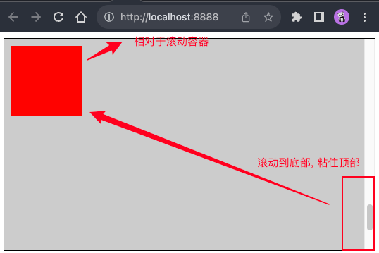
纵向层级 z-index
因为一旦定位就会脱离文档流, 那么如果两个元素定位的位置重合, 那么该显示哪个元素呢?
如果元素重叠在一起, 可以使用 z-index 控制元素的上下层级, 数值越大越在上面
这个不好描述, 直接看图吧, 一图胜千言
